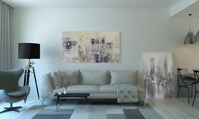
Maybe you are an enthusiast of Interior Design and you love to see an empty room, imagining what’s the best way to fill it with cool furniture and give direction to light and the flow of people in the space. But then, you take a magazine and see things like accent chair, or terms like emphasize, proportion, or rhythm and feel pretty unsecure on what’s the role played by those concepts.
As any profession, Interior Design has its jargon. Some designers are more inclined to use it than others when they speak with a customer, but you can be sure that a good interior designer manages every concept with efficiency, even when they don’t speak explicitly about it. Let’s take a brief look at several terms and concepts often used in the fascinating world of today’s Interior Design, starting with the key Interior Design styles nowadays.
Modern
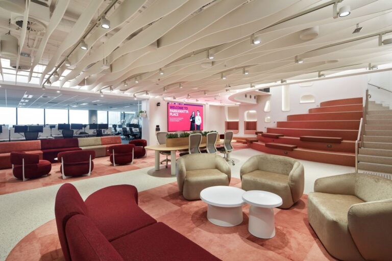
Modern style is characterized by clean lines, simple shapes, and neutral colors. It emphasizes functionality and minimalism, avoiding unnecessary ornaments and clutter. Modern style is inspired by the design movements of the early 20th century, such as Bauhaus and Art Deco. An example of modern style is a white living room with a sleek sofa, a glass coffee table, and a geometric rug. Modern furniture is also very versatile and can blend well with other styles. However, some people might find it too cold, impersonal or boring.
Contemporary
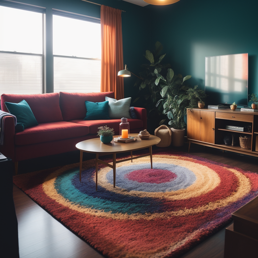
Contemporary style is similar to modern style, but more flexible and dynamic. It reflects the current trends and preferences of the designers and clients, incorporating new materials, technologies, and influences from different cultures. Contemporary style is often eclectic and experimental, mixing elements from different styles and eras. An example of contemporary style is a colorful living room with a mix of patterns, textures, and accessories, like a Mario Bellini Sofa surrounded by a Arco Lamp and a Tulip Table over a Morocco rug. Contemporary is more dynamic and expressive than modern furniture, and it reflects the latest trends and innovations in design, but it can also be more expensive, hard to find or outdated quickly.
Traditional
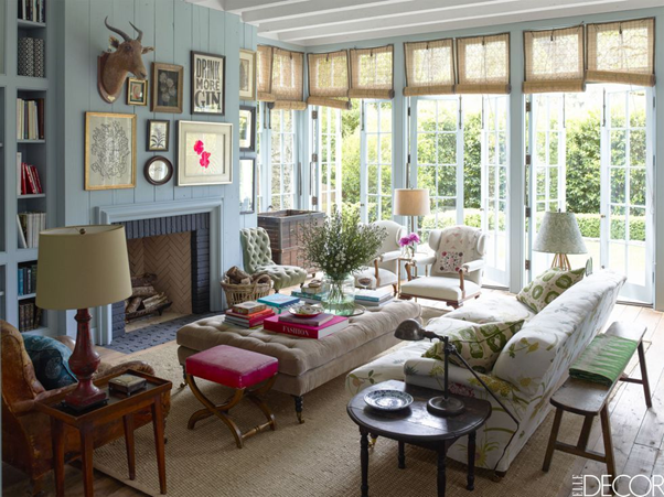
The traditional style is influenced by the classic European design of the 18th and 19th centuries, such as Georgian, Victorian, and French Country. It features rich colors, ornate details, and elegant furniture.
The traditional style creates a warm and cozy atmosphere, with a sense of history and continuity. An example of traditional style is a dining room with a wooden table, upholstered chairs, and a crystal chandelier. Traditional furniture can create a cozy and warm atmosphere in your home, but it can also be too heavy, dark or cluttered.
Minimalist
The minimalist style is based on the principle of “less is more”. It reduces the design elements to the essential, creating a calm and serene space. The Minimalist style uses monochromatic colors, geometric forms, and natural materials. The minimalist style is influenced by Japanese Zen philosophy and Scandinavian design. An example of minimalist style is a black and white kitchen with a minimalist island, a marble backsplash, and a few plants. Minimalist furniture can create a spacious and airy feel in your home, but it can also be too plain, stark, or monotonous.
Scandinavian
The Scandinavian style is inspired by the Nordic countries and their lifestyle. It combines functionality, simplicity, and comfort, creating a cozy and inviting space. The Scandinavian style uses light colors, natural materials, and organic shapes. The Scandinavian style often incorporates elements of hygge, a Danish concept of coziness and well-being. An example of Scandinavian style is a living room with a cozy sofa, a knitted blanket, a wooden coffee table, and candles. Scandinavian furniture can create a comfortable and inviting look in your home, but it can also be too casual, bland or common.
Essential Elements Of Design
The elements of interior design are the basic components that make up any interior space. They include:
Space. The physical area that is available to be designed. Space can be divided into positive space (occupied by objects) and negative space (empty areas). For example, a living room can have a positive space filled with furniture and accessories, and a negative space that creates a sense of openness and airiness.
Line. The shape and form of objects and structures that define the boundaries and edges of a space. Line can create movement, contrast, harmony, and balance. For example, a staircase can have horizontal lines that create stability, vertical lines that create height, and diagonal lines that create dynamism.
Shape. The outline or silhouette of objects and structures that create a sense of volume and depth. Shape can be geometric (regular and angular) or organic (irregular and curved). For example, a kitchen can have geometric shapes such as cabinets, countertops, and appliances, and organic shapes such as fruits, plants, and dishes.
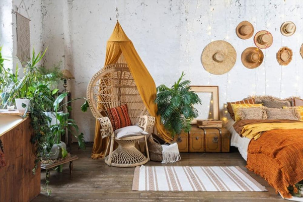
Color. The visual perception of light reflected by objects and surfaces. Color can create mood, emotion, contrast, and harmony. For example, a bedroom can have warm colors such as red, orange, and yellow that create a cozy and inviting atmosphere, or cool colors such as blue, green, and purple that create a calm and relaxing atmosphere.
Texture. The tactile quality of objects and surfaces that appeal to the sense of touch. Texture can be visual (how something looks) or actual (how something feels). For example, a bathroom can have smooth textures such as tiles, glass, and metal, or rough textures such as wood, stone, and fabric.
Light. The natural or artificial illumination that affects the visibility, color, mood, and ambiance of a space. Light can be ambient (general), task (focused), or accent (decorative). For example, a dining room can have ambient light from a chandelier, task light from a table lamp, and accent light from candles.
Pattern. The repetition or arrangement of shapes, colors, lines, or textures that create visual interest and unity. Pattern can be regular (consistent) or random (varied). For example, a living room can have regular patterns such as stripes, checks, or polka dots on the walls, curtains, or cushions, or random patterns such as floral, animal print, or abstract on the rugs, paintings, or vases.
Integrating the Elements of Design into a Cohesive Project
One of the key aspects of interior design is to know how the elements of space, line, shape, color, texture, light, and pattern, are incorporated into a room for a cohesive design. Here are some examples of how these elements can be used:
Space. A good balance between positive and negative space can create a sense of harmony and comfort in a room.
Line. Horizontal lines can make a room appear wider or more relaxed, while vertical lines can make it appear taller or more formal.
Line. Shape is the form or silhouette of an object or a surface. It can be geometric (such as squares, circles, triangles) or organic (such as curves, waves, natural forms). Shape can create interest, variety, and balance in a room. For example, geometric shapes can make a room appear more structured and orderly, while organic shapes can make it appear more natural and dynamic.
Color. Color can create a mood, atmosphere, and energy in a room. For example, warm colors (such as red, orange, yellow) can make a room appear more cozy and inviting, while cool colors (such as blue, green, purple) can make it appear more calm and soothing.
Texture. Texture can create depth, dimension, and contrast in a room. For example, rough textures can make a room appear more rustic and cozy, while smooth textures can make it appear more sleek and modern.
Light. Light can create ambiance, mood, and focus in a room. For example, natural light can make a room appear more airy and spacious, while artificial light can make it appear more cozy and intimate.
Pattern. Pattern can create rhythm, movement, and interest in a room. For example, regular patterns can make a room appear more organized and harmonious, while irregular patterns can make it appear more playful and eclectic.
The Principles of Interior Design
Interior design is based on some fundamental principles that guide the designers in their work. Let’s explore briefly what each of these principles means and how they can be applied to any interior design project.
Balance
Balance is the sense of equilibrium and stability in a space. Balance can be achieved by arranging the elements of a space according to their visual weight, size, shape, color, or texture. There are three types of balance: symmetrical, asymmetrical, and radial. Symmetrical balance is when the elements are arranged in a mirror-like fashion on either side of a central axis. Asymmetrical balance is when the elements are arranged in an uneven but harmonious way that creates visual interest. Radial balance is when the elements are arranged around a focal point, such as a circular table or a chandelier.
Contrast
Contrast is the difference between two or more elements that creates visual interest and drama in a space. Contrast can be created by using opposite or complementary colors, shapes, textures, sizes, or styles. For example, a black and white color scheme creates a strong contrast that can make a space look modern and elegant. A round table paired with angular chairs creates a contrast of shapes that can make a space look dynamic and playful.
Emphasis
Emphasis is the principle of creating a focal point or a center of attention in a space. Emphasis can be achieved by using an element that stands out from the rest of the space in terms of color, size, shape, texture, or style. For example, a fireplace can be an element of emphasis that draws the eye and creates a cozy atmosphere. A large painting can be an element of emphasis that adds personality and character to a space.
Proportion
Proportion is the principle of creating a sense of harmony and balance among the elements of a space based on their relative size and scale. Proportion can be influenced by the size of the space itself, as well as by the human scale and perception. For example, a small sofa can look out of place in a large living room, while a large sofa can make a small living room look cramped. A good rule of thumb for proportion is to use the golden ratio, which is a mathematical formula that defines an ideal proportion for aesthetics and beauty.
Rhythm
Rhythm is the principle of creating a sense of movement and flow in a space by repeating or alternating elements of design. Rhythm can be created by using patterns, colors, shapes, textures, or styles that create a visual tempo or beat. For example, a striped wallpaper can create a rhythm that makes a space look lively and energetic. A monochromatic color scheme can create a rhythm that makes a space look calm and serene.
Unity
Unity is the principle of creating a sense of cohesion and harmony among the elements of a space by using a consistent theme or style. Unity can be achieved by using similar or complementary colors, shapes, textures, sizes, or styles that create a visual connection among the elements. For example, a rustic theme can create unity by using natural materials, warm colors, and simple shapes that evoke a cozy and inviting feeling. A minimalist theme can create unity by using neutral colors, sleek shapes, and clean lines that evoke a modern and sophisticated feeling.
Variety
Variety is the principle of creating a sense of diversity and interest in a space by using different or contrasting elements of design. Variety can be achieved by using different or contrasting colors, shapes, textures, sizes, or styles that create visual excitement and appeal. For example, mixing vintage and contemporary furniture can create variety that makes a space look eclectic and unique. Mixing floral and geometric patterns can create variety that makes a space look fun and creative.
Must-Know Furniture and Decor Terminology
Do you want to speak of designing and sound like a Pro? Maybe you’re now handling already all the jargon of a reputed designer in some intuitive way and you just need to recognize all terms. Take a look at some of the most familiar terms in vogue now.
Scale. This refers to the size of an object or a space in relation to another object or space. For example, a large sofa might look out of scale in a small living room.
Proportion. This refers to the balance and harmony of different elements in a design. For example, a room with high ceilings might need taller furniture and larger artwork to create a good proportion.
Focal point. This refers to the element that draws the most attention in a design. It can be anything from a fireplace, a window, a painting, or a statement piece of furniture. A focal point helps to create interest and contrast in a space.
Accent piece. These are items that add color, texture, pattern, or personality to a design. They can be pillows, rugs, lamps, vases, or anything else that complements the main furniture and decor. Accent pieces help to create a cohesive and inviting look.
If you love Interior Design and furniture you will be speaking like a pro very soon. Congratulations with your new projects.
